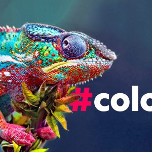
As we emerge into a new year, designers are getting creative with a fresh wind of colour trends. Plus, discover the Pantone colour of the year 2022.
This fresh new wind consists of colours that have one collective goal: Bringing serenity. It will still be a colourful year, just think of it as not so much in-your-face. This year’s colours are all about calm and peace of mind. I think we all need a bit of that.
So, buckle up for colours less intense and more subtle. Shades and tones that will emanate softness and gentleness. Colours that are quiet and peaceful, not so fiery. Sounds boring to you? Not at all! Be prepared to see creative and contemporary twists on these colour trends like never before.
Excited to get a sneak peek at the colours you are going to spot everywhere this year and beyond? Here are the top 9 colour trends for 2022!
Pastels are soft, cute, they radiate innocence. Not anymore… Get ready for pastels that are going to pop.
Truly, in 2022 designers are giving pastels an interesting spin. Think bold with this poppin’ colour trend!


Combining bolder pastel tones with abstract objects and funky patterns, this year it is all about trying out new ways. 2022 will see a modern, unconventional twist on the traditional soft pastels, altering their perception. Not so innocent anymore, right?
If you want to try something new, this popping trend might be just for you.
If you’ve been following colour trends over the last few years, you would have seen earth tones gaining popularity. Rustic, natural colours are the contrast to the bright and bold tones we used to see.
Earthy tones resemble nature, our planet. When used in branding it forms a perception of a natural, organic, down to earth kind of vibe. If you’re all about sustainable business and green marketing, these are the sort of colours you want to go with.


As consumers are longing to reconnect with nature in 2022 and slow down life, this colour trend is a great communication tool for brands that are more conscious and slow paced.
But using subtle earth tones are not only suitable for mindful brands. We live in a big and bright world where standing out becomes more and more difficult. Toning down your brand a little could work a treat.
“Less is more.”
Robert Browning, 1855
Ahhh precious jewels… They are beautiful, like the mystical forest green of an Emerald or a Sapphire’s 50 shades of deep ocean blue. Jewel tones are highly saturated colours, meaning that they are quite intense. But wait, didn’t I tell you that 2022 will be the year of calm colours?
Even though they are bold, jewel tones are still known to be calm. Can you guess why? Our good old royals. Yes, these precious tones are associated with royalty therefore with elegance and wealth. That is why they are perceived as highly sophisticated colours.


Combine this colour trend with subtle earth tones and you created yourself an elegant, serene look for 2022.
Besides dreamy pastels, earthy tones and royal hues, you’re going to come across soft neutral colours. Think of peachy shades, eggshell, mint green – warm colours found in nature. These gentle, neutral tones are something that we are all familiar with. They are comforting, making you feel light and at ease.


Keep in mind to use them with simple messaging. Simplicity is important to maintain a calm, comforting feeling. Needless to say that comfort is what people are seeking most in 2022.
Another colour trend that is predicted to take off in 2022 are flower patterns. Not your usual bright colourful flowers though. Floral patterns with a softened look, almost like looking through an analog lens.


By using subtle flower patterns you can give your brand an old-school look. The good thing about that? Consumers look at your brand and associate it with the good old times. 2022 vintage flowers are the way to go if you want to produce a comforting, almost nostalgic image.
Now we’re getting into real nostalgia. Call Jane Fonda, because the 80s are back! As we seek serenity, 2022 will see a lot of soft and subtle colours. But there is another way to create a calm image with more lively colours.
The 80s sure were bright and funky. But even though you will see the intense colours of the 80s this year, creating a calm image isn’t always about the colours.

You can use nostalgia to evoke comforting emotions. The colours don’t really matter. This works so well, because people often see the past as less stressful and less difficult. That’s what this colour trend is all about. Yes, the good old times…
Let’s stay in the 80s for a little longer. There’s another colour trend from that era that is making its comeback in 2022.
Have you heard of Memphis design? For those of you who haven’t, Memphis design marks the design world in the 80s. Its characteristics are vibrant colours and geometric shapes. In 2022, Memphis design is coming back with a modern twist.


In contrast to minimal, polished designs this modernised Memphis design emanates a playful and lively vibe. It’s all about funky patterns and adding a slice of humour to a brand. Just what we need in 2022!
If one colour trend stands out this year, this is it. Watch out for punchy colours used with more punchy colours. But beware! This colour trend is only for the brave ones. If done badly, it can quickly look aggressive and disruptive – the opposite of what we want.
But if done right, you can create something that is quirky and fun.

If you want to create an image that is edgy, playful and daring, this colour trend might just be for you.
Last but not least, the Pantone colour of the year. A combination of shades of blue with violet red, this colour is quite interesting. Don’t you think?

Pantone describes this colour as “displaying a carefree confidence and a daring curiosity” where it “places the future ahead in a new light.” Very Peri is here to awaken our inner creativity by helping us embrace the new way of life.
Read more about Very Peri here!

Are you looking to launch something exciting this year? Or are you thinking about refreshing your brand? No matter what design projects you have ahead of yourself, hopefully this article could give you some inspiration.
Your brand is important. Make it shine.
At Marketing Together, we understand the importance of this investment. That’s why we’re offering a new, custom-designed, conversion-optimised website for free when you sign up for six months of digital marketing services—a $5000 value at no extra cost.
Don’t let your website be the weak link in your marketing strategy. Contact us today to start building a site that not only looks great but also performs brilliantly.